How to Analyze Mobile vs Desktop Load Times
3/16/2026 • 8 min read
How to Analyze Mobile vs Desktop Load Times
Mobile pages load 87.84% slower than desktop, and over half of mobile users leave if a site takes more than 3 seconds to load. With mobile-first indexing affecting search rankings, understanding these differences is critical. Key metrics like First Contentful Paint (FCP), Largest Contentful Paint (LCP), and Time to First Byte (TTFB) reveal performance gaps. Mobile devices face challenges like slower networks and weaker hardware, making tailored testing essential.
To compare mobile and desktop load times effectively:
- Use tools like dCLUNK™, Google PageSpeed Insights, and Chrome DevTools for precise measurements.
- Focus on metrics like LCP ≤ 2.5 seconds, TTFB ≤ 0.8 seconds, and Speed Index ≤ 3.4 seconds for mobile.
- Run tests under realistic conditions, such as throttling for slower mobile networks.
- Test multiple times and cross-check results to ensure accuracy.
Improving mobile performance can boost user satisfaction, reduce bounce rates, and increase conversions. Start by identifying bottlenecks, optimizing assets, and regularly testing both platforms.
Core Metrics for Page Load Time Analysis
Mobile vs Desktop Load Time Performance Metrics Comparison
Tracking the right metrics is crucial for identifying performance differences between mobile and desktop. Here's a breakdown of the key ones to monitor.
Page Load Time and First Contentful Paint (FCP)
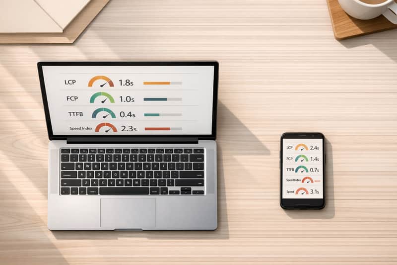
First Contentful Paint (FCP) measures the time it takes for a browser to display the first piece of content - whether it's text, images, or canvas elements - after a user navigates to a page. It’s an early indicator that the page is starting to load. A solid FCP score is 1.8 seconds or less [12, 17].
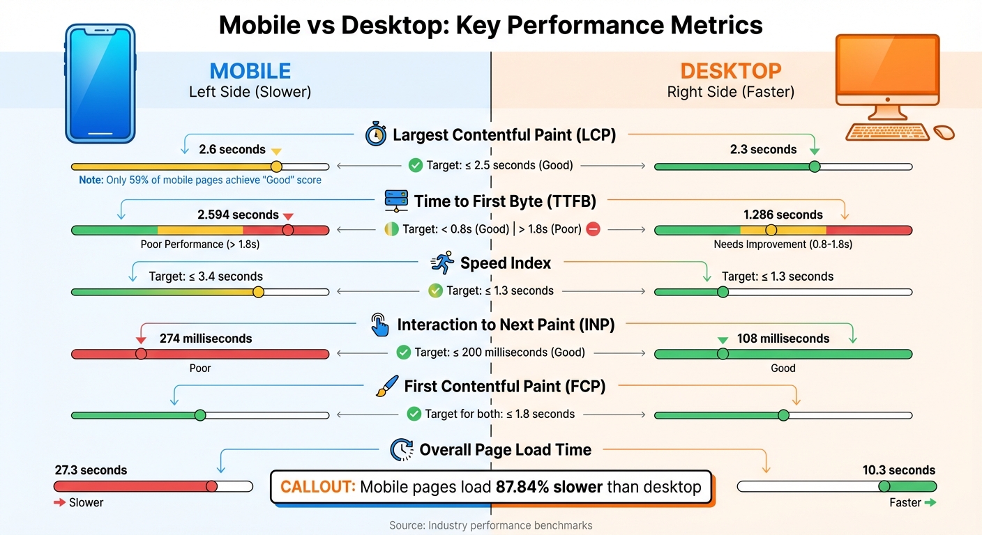
Largest Contentful Paint (LCP), on the other hand, reveals when the largest visible element on the page finishes rendering. This metric is vital for understanding perceived loading speed and is a key ranking factor for Google [11, 13, 14]. To meet standards, your LCP should be 2.5 seconds or less for at least 75% of visits [11, 14]. Current averages show that desktops achieve an LCP of 2.3 seconds, while mobile devices lag slightly at 2.6 seconds, with only 59% of mobile pages earning a "Good" score [13, 20].
Time to First Byte (TTFB) and Speed Index
Time to First Byte (TTFB) measures how long it takes for the server to respond after a request is made. This metric directly impacts both FCP and LCP performance. A good TTFB is under 0.8 seconds, while anything over 1.8 seconds is considered poor. On average, desktops clock in at 1.286 seconds, while mobile devices average a much slower 2.594 seconds [6, 20].
Speed Index (SI) evaluates how quickly content becomes visible during the page load process. It reflects the overall visual progress of rendering. For mobile, a good Speed Index is 3.4 seconds or less, while desktops should aim for 1.3 seconds or less [19, 20].
Why Mobile and Desktop Metrics Differ
Mobile devices often struggle with slower load times compared to desktops due to less processing power and reliance on slower cellular networks [3, 5, 13]. On average, mobile pages take 87.84% longer to load, with fully loaded times averaging 27.3 seconds on mobile versus 10.3 seconds on desktop.
Responsiveness also varies significantly. For instance, the Interaction to Next Paint (INP) metric averages 108 milliseconds on desktop, but jumps to 274 milliseconds on mobile. This difference is largely due to heavy JavaScript, which can bog down mobile devices. Additionally, mobile TTFB is often more affected by the number of HTML requests.
Testing tools like Lighthouse replicate these challenges by simulating mobile conditions. They throttle tests to mimic a mid-range device on a slow 4G connection (about 1.6 Mbps), while desktop tests assume high-speed wired connections.
sbb-itb-641714f
Tools for Testing Mobile and Desktop Load Times
To get accurate load time data for both mobile and desktop platforms, you need the right tools. Each one provides distinct insights into how your site performs across devices.
Using dCLUNK™ by CLUNKY.ai
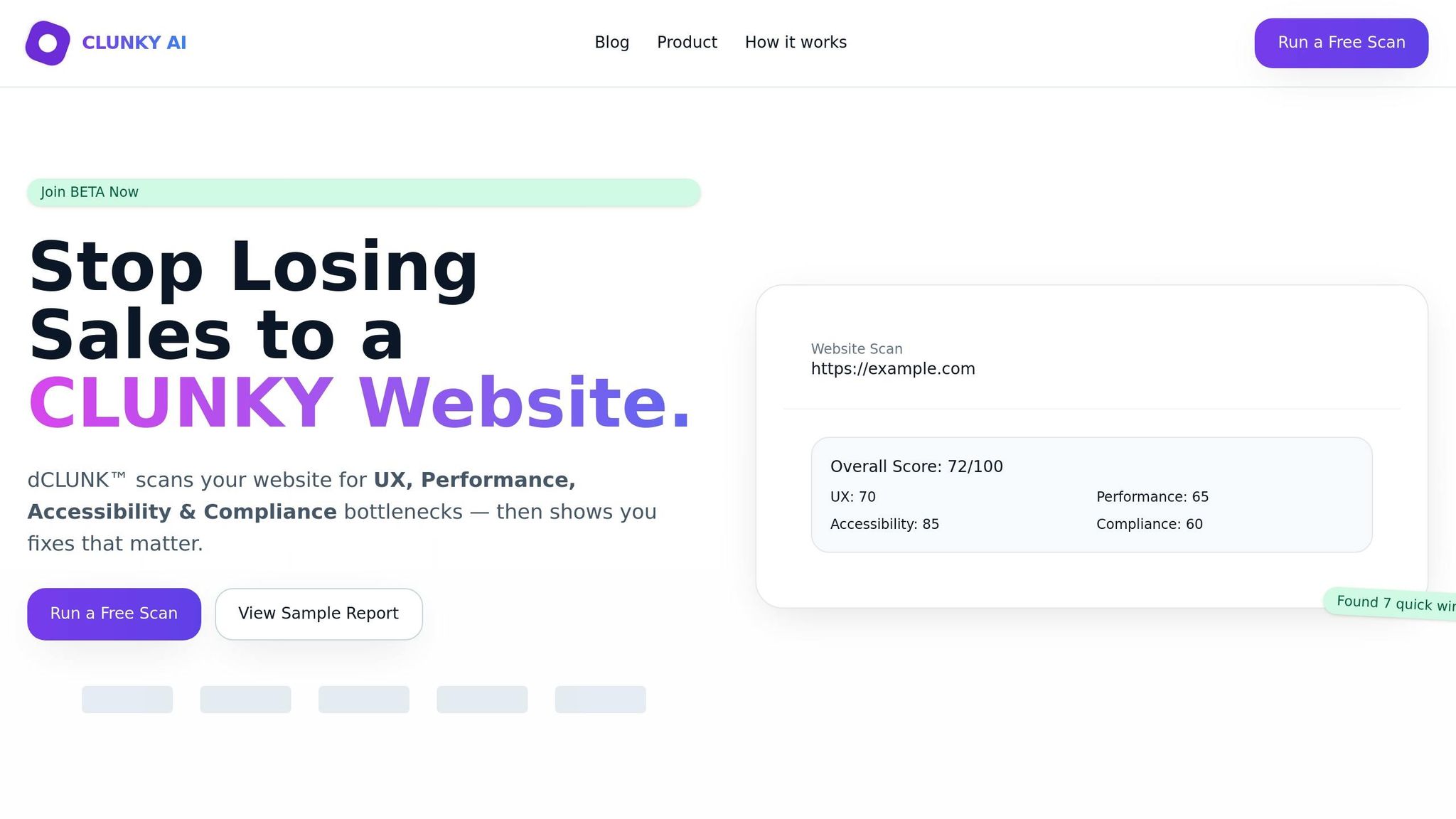
dCLUNK™ is designed to measure critical metrics like LCP, TBT, INP, CLS, and TTFB. It completes scans in under two minutes, delivering actionable recommendations to enhance performance. These include quick fixes and ROI estimates, making it easier to identify differences between mobile and desktop performance. All scans are free, and a sample report is available to help locate bottlenecks across devices.
Google PageSpeed Insights
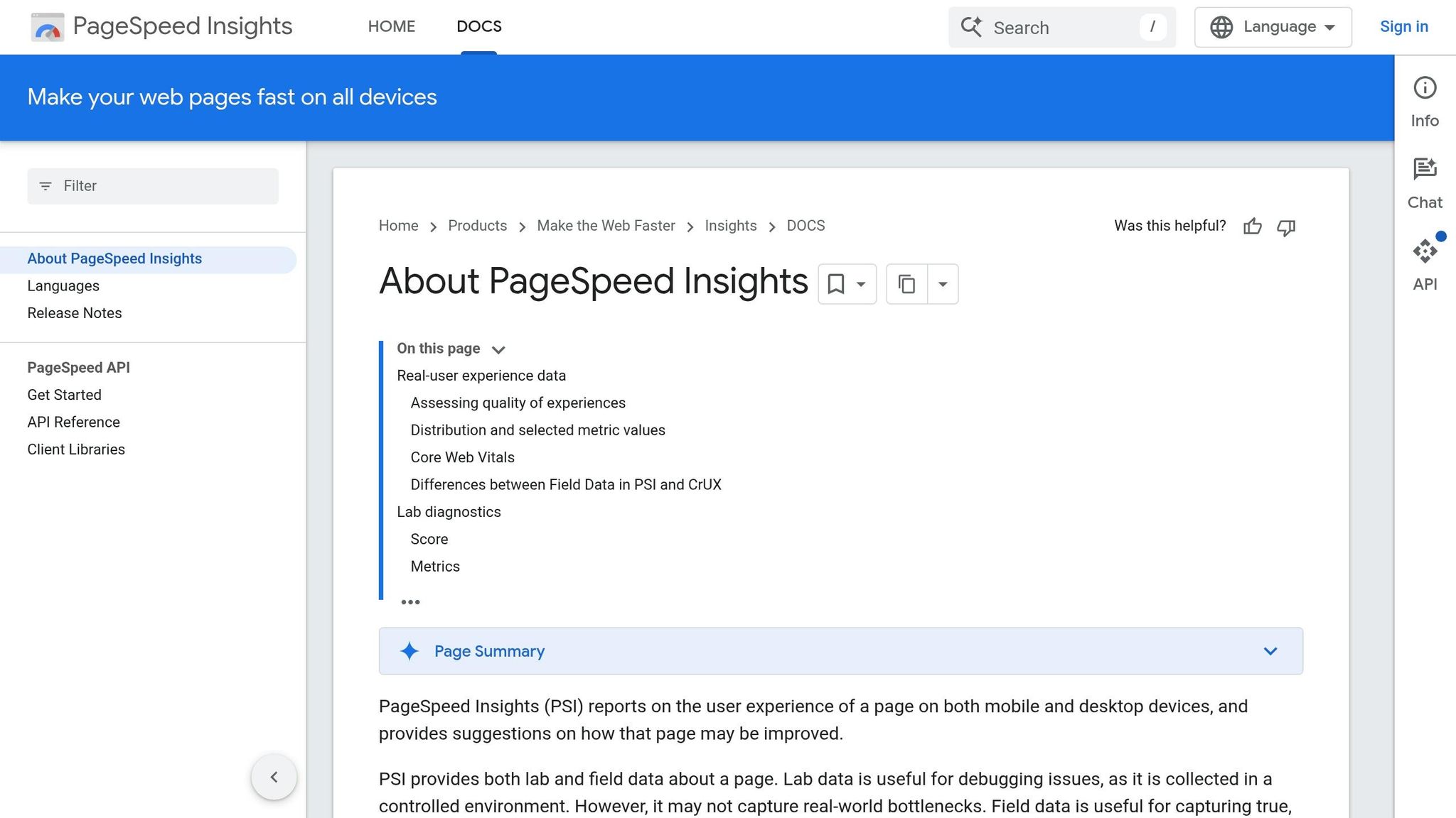
Google's PageSpeed Insights (PSI) combines lab data from Lighthouse with field data from the Chrome User Experience Report, which reflects user performance over the past 28 days. PSI provides separate scores for mobile and desktop, categorizing performance as:
- Good: 90 or above
- Needs Improvement: 50–89
- Poor: Below 50
For mobile tests, PSI simulates a mid-tier Moto G4 device on a mobile network. Desktop tests use an emulated desktop setup with a wired connection. This approach allows for a clear comparison of performance across platforms.
"Lab data is useful for debugging issues, as it is collected in a controlled environment. However, it may not capture real-world bottlenecks. Field data is useful for capturing true, real-world user experience." – Google PageSpeed Insights
Chrome Developer Tools
Chrome DevTools offers a hands-on way to test mobile performance directly in your browser. Using Device Mode, you can emulate devices like iPhones or Pixels. Network throttling lets you simulate slower connections, such as Fast 3G or Slow 3G. The Performance panel captures real-time metrics like LCP, CLS, and INP, giving immediate feedback.
To better mimic real-world mobile conditions, you can apply CPU throttling (up to 20× slowdown) alongside network throttling. Testing in Incognito mode is recommended to avoid interference from browser extensions. DevTools runs locally, making it ideal for debugging issues like scrolling lag or unresponsive buttons.
These tools provide the precision you need to measure and compare load times across platforms effectively.
How to Compare Load Times Across Platforms
Once you’ve gathered your testing data, the next step is comparing mobile and desktop performance. This isn’t always simple, as the two platforms operate under different conditions. Using the metrics and tools mentioned earlier, here’s how you can make precise comparisons between them.
Account for Different Testing Conditions
Mobile and desktop tests differ in their setups. Lab tests for mobile simulate specific conditions, such as 1.6 Mbps bandwidth and 150 ms RTT, and apply a 4× CPU slowdown to mimic mid-range processors. Meanwhile, desktop tests run at full capacity. Because of this, identical load times on both platforms might not equate to the same user experience.
Screen size also plays a role. For instance, the Largest Contentful Paint (LCP) element on a desktop might not even be visible on a mobile device. An image that qualifies as LCP on a desktop could be off-screen on mobile, leading to a different LCP element being measured. To ensure an accurate comparison, review the final screenshots from your tests to confirm both platforms are measuring the same content. Discrepancies, like a cookie banner appearing on mobile but not on desktop, indicate the comparison isn’t aligned.
Geographic location adds another layer of complexity. The physical distance between the test server and the website’s host can influence Time to First Byte (TTFB). For example, in the U.S., the 75th percentile TTFB averages 0.8 seconds on mobile and 0.6 seconds on desktop. Running tests from multiple locations helps you understand how latency varies across regions.
Once these testing conditions are clear, the next step is verifying and cross-checking your results to ensure accuracy.
Verify and Cross-Check Your Results
After accounting for testing conditions, it’s essential to verify your data. Run at least five tests per URL and use the median result to filter out anomalies caused by temporary network issues or server fluctuations. To minimize variability, consider scheduling tests during off-peak hours.
Using multiple testing tools can also uncover inconsistencies. If results differ significantly, examine waterfall charts to pinpoint resources that might be blocking the main thread. For example, an electronics retailer managed to reduce its mobile LCP from 4.2 seconds to 1.5 seconds, resulting in a 43% increase in conversions after optimizing images and cutting JavaScript by 40%.
Additionally, understand whether your testing tool uses Simulated throttling or Packet-level throttling. Simulated throttling estimates performance based on a fast load, while packet-level throttling slows the network for a more realistic test. If your lab results don’t align with field data from real users, it could indicate that your throttling settings don’t reflect your audience’s actual conditions.
Conclusion
Analyzing mobile versus desktop load times means diving into factors like hardware capabilities, network reliability, and testing environments - all of which directly impact how users experience your site. Mobile devices often lag behind desktops due to weaker processing power and the unpredictability of cellular connections. To add to the challenge, over 40% of websites still fail to meet Google's Largest Contentful Paint (LCP) threshold.
When it comes to evaluating performance, both lab and field data play crucial roles. Lab data helps identify specific bottlenecks, while field data reflects what users actually experience. SEO expert Jason Rostar sums it up perfectly:
"Field data shows what real users experience. Lab data explains why those problems exist. You need both to make meaningful improvements to Core Web Vitals".
Keep an eye on the key metrics: LCP ≤ 2.5 seconds, INP ≤ 200 milliseconds, and CLS ≤ 0.1. With Google's mobile-first indexing now giving mobile performance 40% more weight than desktop in search rankings, prioritizing mobile optimization is a must.
To get started, implement regular performance testing using tools like dCLUNK™. Automate weekly audits, set clear performance goals, and tackle quick fixes such as preloading LCP images or streamlining JavaScript. Meeting Core Web Vitals thresholds can lead to a 24% lower bounce rate. Staying consistent with monitoring and improvements will ultimately benefit both user satisfaction and your business outcomes.
FAQs
How do I set realistic mobile throttling for tests?
To mimic real-world mobile conditions, Chrome DevTools makes it easy to set up network throttling. Just open DevTools, navigate to the Network tab, and pick a preset like “Slow 3G.” If you need more control, you can create a custom profile by adjusting latency and bandwidth settings. Don’t forget to reload the page to see how it performs under these conditions.
For more advanced testing, consider tools like Network Link Conditioner or Fiddler. These allow you to simulate factors like latency, packet loss, and bandwidth limitations for an even deeper analysis.
Why do mobile and desktop LCP measure different elements?
Mobile and desktop Largest Contentful Paint (LCP) often measure different elements due to the way content loads and displays on each type of device. Things like screen size, processor performance, and network speed play a big role in determining which element is recognized as the largest and how quickly it shows up. Mobile devices, for example, tend to deal with slower connections and less powerful hardware, which can lead to noticeable differences in LCP elements and their loading times when compared to desktops.
What should I do if lab and field results don’t match?
When lab results and field data don’t align, it’s important to approach the differences thoughtfully. Lab tests are conducted in controlled environments, offering consistent conditions, while field data captures how users interact with your site in diverse, real-world scenarios. This contrast often explains why lab tests might show stronger performance compared to what users experience day-to-day. To get a well-rounded view of your website's performance, use field data to validate real user experiences and consider both types of data together for a balanced analysis.
Explore the six basics
Every Clunky AI article maps back to one or more of the questions a business site has to answer.
Related Posts
Tags PerformanceResponsive DesignUser Experience
Category Website Optimization