How Cognitive Load Impacts User Experience
6/15/2026 • 10 min read
How Cognitive Load Impacts User Experience
Too much mental effort hurts UX fast. When people have to think too hard, they make more mistakes, take longer, and leave more often. Research in the article links lower mental effort with better task completion, fewer errors, and in checkout flows, 25%–35% higher completion rates.
Here’s the short version:
- Mental effort in UX is the amount of brainpower a page or task uses
- There are 3 types of load:
- Task load: effort caused by the task itself
- Extra load: effort caused by poor design
- Learning load: effort that helps users learn
- The biggest UX gains usually come from cutting extra load
- Common trouble spots are:
- cluttered pages
- too many choices
- weak visual hierarchy
- long forms
- unclear navigation
- split-up instructions and error messages
- Teams can track this through:
- task time
- completion rate
- error rate
- abandonment
- rage clicks
- user testing
- The fix is often simple: show less, group related items, keep labels clear, use familiar patterns, and break long tasks into steps
One stat says a lot: shoppers shown 24 jam options bought at 3%, while shoppers shown 6 options bought at 30%. That same pattern shows up on websites too - more choice and more clutter often lead to less action.
If I had to sum up the article in one line, it’s this: when I reduce extra thinking, I make it easier for users to finish the job.
Why Cognitive Load Matters for UX Designers
sbb-itb-641714f
What cognitive load means in UX
Cognitive Load Types in UX: What to Cut, Keep & Support
Cognitive load is the mental effort it takes to use an interface. Every step on a website - scanning a product comparison table, entering a shipping address, or picking an item from a navigation menu - uses limited working memory. Once that mental bandwidth gets stretched too far, people slow down and make mistakes. That’s why cognitive load is a UX risk you can actually track.
High cognitive load tends to show up in plain ways: slower task times, more mistakes, and lower completion rates.
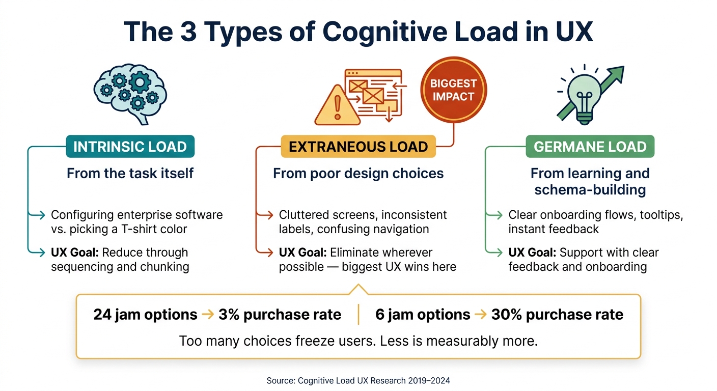
Intrinsic, extraneous, and germane load explained
Not all mental effort is the same. Researchers usually divide cognitive load into three types, and each one points to a different design move.
Intrinsic load comes from the task itself. Configuring enterprise software is simply harder than picking a T-shirt color. Design can’t erase that difficulty, but it can make the task easier to process by breaking it into a clearer sequence.
Extraneous load comes from bad interface decisions - cluttered screens, inconsistent labels, or confusing navigation. This is the kind of effort users shouldn’t have to spend. It adds friction without helping them get anything done.
Germane load is the useful kind of mental work. It happens when users are learning how something works, like moving through a clear onboarding flow, reading a well-placed tooltip, or seeing instant feedback after an action. Good UX puts this kind of effort to work so people learn faster.
These load types connect directly to design choices.
| Load Type | Source | UX Goal |
|---|---|---|
| Intrinsic | Task complexity | Reduce through sequencing and chunking |
| Extraneous | Poor design choices | Eliminate wherever possible |
| Germane | Learning and schema-building | Support with clear feedback and onboarding |
That framework helps explain the research on measurement and outcomes.
Working memory limits and why clutter hurts usability
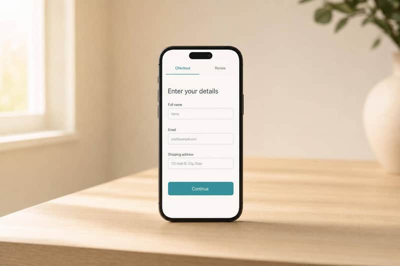
The main limit is pretty simple: working memory can hold only a few chunks at a time, so clutter comes at a cost. When a page throws too many elements at the user, the brain has to sort through noise before it can do the task. A checkout form with too many visible fields, a homepage packed with competing calls to action, or a navigation menu with inconsistent labels all add extra mental work just to help users figure out where they are.
You can see this in choice behavior too. In a well-known study on consumer choice, shoppers shown 24 varieties of jam bought at a rate of only 3%, while shoppers shown just 6 varieties bought at a 30% rate. Too many options can freeze people up. Instead of choosing, they delay the decision or leave the task unfinished.
Split attention adds more load when related information is separated across the page. A form field with its error message placed at the top of the page instead of right below the field is a classic case. Keep labels, errors, and instructions together so users don’t have to hold pieces of information in memory while hunting for the rest.
Next, we’ll look at how researchers measure cognitive load in live interfaces.
What research says about cognitive load and UX outcomes
Once load is defined, the next step is figuring out how researchers track its effect in actual interfaces. Systematic reviews of digital usability studies from 2019 to 2024 show that cognitive load shapes learnability, efficiency, memorability, errors, and user satisfaction. Study after study also links measured cognitive load with slower task completion and lower satisfaction.
How researchers measure cognitive load
Researchers tend to use two main approaches: subjective measures and objective measures. The most common subjective tool is the NASA Task Load Index (NASA-TLX), a six-part scale that looks at mental demand, physical demand, temporal demand, performance, effort, and frustration.
On the objective side, researchers use methods like dual-task testing. They also watch for behavioral signals, such as form errors, erratic mouse movement, and repeated clicks on elements that don’t respond.
Taken together, these methods help connect mental effort with task time, errors, and satisfaction.
Where the research evidence is strongest
The evidence is strongest in e-commerce and form-heavy interfaces. In one e-commerce study, users found products in 273 seconds on a streamlined site versus 607 seconds on a more complex one. In a 2025 study, participants using an interactive tool reported lower mental demand and finished faster than people using a text-heavy version.
Across both cases, the pattern stays the same: reducing extraneous load - the mental effort caused by poor design rather than the task itself - leads to better task performance and higher satisfaction without changing the underlying task.
That sets up a practical question for UX teams: which interface choices add unnecessary load, and which ones take it away?
Interface choices that increase or reduce cognitive load
Not every design choice asks the same amount from a user’s brain. Some choices quietly eat up working memory before the person even gets to the thing they came to do. Others make the path feel almost effortless. Research shows the same pattern again and again: when design adds extra mental effort, task speed drops, mistakes go up, and satisfaction falls. The biggest wins tend to come from cutting that extra load in hierarchy, navigation, and forms.
Visual complexity, hierarchy, and content density
When too many elements fight for attention - picture five blue buttons on the same screen - people struggle to tell what matters most. That often leads to hesitant clicks or flat-out wrong ones. In many cases, the fix doesn’t require a total redesign. One primary action with stronger contrast and a larger size can guide attention, while secondary actions fade into the background.
Dense content creates a similar problem. If the page has no clear structure, users have to work harder just to scan it. Group related details into short sections with clear labels so people can process the page in smaller pieces.
Simplicity cuts visual noise that gets in the way of the task.
Navigation, forms, and task flow design
Navigation labels should make sense at a glance. If users have to stop and decode what a label means, the interface is already slowing them down. The same thing happens when patterns shift or terms change from one screen to the next. Instead of moving through the task, people have to pause and learn the interface all over again . Familiar conventions - like search in the top-right corner or a standard hamburger menu - help people act through recognition instead of memory.
Forms are often where friction hits hardest. Showing 30+ fields on one screen can swamp working memory and push people to give up. Breaking a long form into clear steps - shipping, billing, then review - with a visible progress marker such as "Step 2 of 4" makes each screen feel smaller and easier to handle. Defaults and autofill cut down the number of choices users need to make. Validation messages also work better when they appear right next to the field that needs attention .
Common UX patterns and their load tradeoffs
You can see these tradeoffs clearly in a few common patterns:
- Top navigation vs. hamburger menu (desktop): Top navigation keeps choices visible, which lowers memory demand and often leads to fewer errors and faster task completion. On desktop, hamburger menus hide those choices, so users have to do more work to find and use them.
- Single-page form (30+ fields) vs. multi-step wizard: A long single-page form can overload working memory and increase errors. A multi-step wizard limits how many decisions are active on each screen, which lowers extra mental effort and makes the task feel more manageable.
- Text only vs. text paired with a relevant visual: Text by itself puts a moderate strain on memory. Pairing it with a related visual lightens that strain and helps people process the information faster and with better accuracy.
Next, we’ll turn these patterns into practical site improvements.
How to apply cognitive load research to website improvements
Steps to remove unnecessary mental effort from your site
Use the patterns above as a simple audit checklist. Start by cutting extraneous load first. That’s usually where the fastest wins are.
A few fixes tend to have the biggest payoff:
- Make one CTA stand out most. Give it a different color and a larger size so people can spot the next step fast.
- Use one term for each concept. If your menu says "Account Settings" but the page header says "Profile Preferences", users have to pause and figure out whether those mean the same thing.
- Stick with familiar placements and patterns. Put search in the top right, use "Checkout" for purchase buttons, and keep "Save" in the same place so people don’t have to decode the interface.
- Show only what people need right now. Put extra details behind a toggle or on a secondary page to keep the first screen easier to process.
- Give instant feedback after each action. A loading spinner, inline confirmation, or simple progress marker shows that the action worked and signals what happens next.
Using scanning and testing to find cognitive friction
Once the plain problems are out of the way, look at your highest-traffic flows for the friction that’s still hanging around. Start with the paths where people drop off, abandon tasks, or trigger rage clicks.
Watch for overload signals like rage clicks, long scrolling with no action, tab switching, or leaving the task to run an external search. Those behaviors usually point to moments where the interface is asking for too much. When you combine scroll-depth data with exit behavior, you can see where people hit that wall.
Automated scans like CLUNKY.ai's dCLUNK™ can flag UX, performance, accessibility, and compliance issues, then sort fixes by priority. Accessibility problems often add friction for everyone, not just people using assistive tech.
Manual usability testing still finds things automated tools miss. Some issues only show up when a person tries to finish a real task from start to finish. Even short, unmoderated sessions can give you solid signals if you track task completion rate, time-on-task, and error rate. Those numbers make it much easier to spot where extraneous load is doing the most damage.
Conclusion: Cognitive load is a measurable UX risk and a design opportunity
Cognitive load isn’t abstract. You can see it in error rates, form abandonment, and task completion times.
Intrinsic load comes from the task itself. Extraneous load comes from design friction. Germane load helps people learn. Cut the first two where you can, and protect the third.
FAQs
How do I know if cognitive load is hurting my website?
Watch for signs like longer task completion times, more errors, high abandonment, and clear hesitation or confusion, such as erratic mouse movements or frequent tab switching.
You may also notice users scrolling far down the page without converting, leaving after one page, engaging very little, repeating the same actions, or struggling to find key information.
Tools like heatmaps, session replays, and task-time analysis can help confirm what’s going on.
What type of cognitive load should UX teams reduce first?
UX teams should cut extraneous cognitive load first. This kind of mental strain comes from design choices that don’t help the user - like cluttered layouts or confusing navigation. When pages feel messy or hard to follow, people have to work harder to figure things out and finish even simple tasks.
Which UX fixes lower cognitive load fastest?
The fastest UX fixes are:
- Simplifying user tasks
- Providing immediate feedback
- Creating a clear visual hierarchy
These changes cut mental effort and help guide users with less friction.
Explore the six basics
Every Clunky AI article maps back to one or more of the questions a business site has to answer.
Related Posts
Tags AccessibilityPerformanceUser Experience
Category Website Optimization